M•A•C Cosmetics User Experience Task Force
M•A•C Cosmetics User Experience Task Force
M•A•C Cosmetics User Experience Task Force
In 2016, observing the increasing power of social media and online influencers, I anticipated a shift from brands controlling their image and messaging to a more de-centralized model where users would participate equally in a brand’s development. Understanding that this new model would require a fundamental shift in the ways a brand approached its consumers, I initiated an internal task force of innovative and change-making colleagues and led them through immersive human-centered ideation sessions to identify key opportunities for progressive consumer engagement.
The task force focused on building data-driven suggestions on how to evolve the MAC Cosmetics brand to center on the user and meet them where they were, as opposed to asking them to enter into MAC’s proscribed world in order to interact with the brand.
The specific output of this task force is confidential, but I am happy to see its fingerprints on the ongoing evolution of the brand.
Premier Fountain
Premier Fountain
Myself and the design team at Streng Design worked with our client, a global food and beverage company to develop physical design and user experience outlines for their new premier beverage dispenser. We created hardware & software frameworks that would allow the premier fountain to become the bedrock of the client's expanding equipment catalogue. Our goal was to not only design an engaging physical machine and user experience, but to create a unified equipment ecosystem that would deliver a superior product as well as become a traffic driver for our client and their clients.
Through market, technology and behavior research, we generated user experience maps, machine personas and visual brand language guidelines as well as outlined social, mobile and augmented reality opportunities that would enable the premier fountain to interact with consumers beyond the physical point of sale.
See more a more detailed outline of this development process: click here>
Maxima User Interface
Maxima User Interface
Client: Maytag
The Maytag interaction team presented me with an initial interface wireframe for the Maxima washer and dryer. I refined and expanded the wireframe flow charts, established screen templates, designed UI graphics, built animations and cut production assets. Along with the final assets and animations, I delivered an official behavior specification document.

Home Appliance Suite
Home Appliance Suite
Client: Kenmore
I led the consultant design development for the full Whirlpool-Kenmore catalog including the refrigeration, cooking, dishwashing & laundry platforms. Working with the Kenmore brand & category leads, I developed design and communications systems that helped to streamline the design through manufacturing processes as well as improve the relationship between Whirlpool-Kenmore and their Sears clients.
Design Ideation
Design Refinement
Best Practice Development
Client Communication Systems
Material & Finish Outlines
Design Specification Documents
Design Intent 3D Data
Engineering 3D Data
Production Method Comparison
Full Scale High Fidelity Model Builds
Design Engineering Quality Control
Production Engineering Interaction


Pyrex Leak Proof Storage
Pyrex Leak Proof Storage
Client: Pyrex


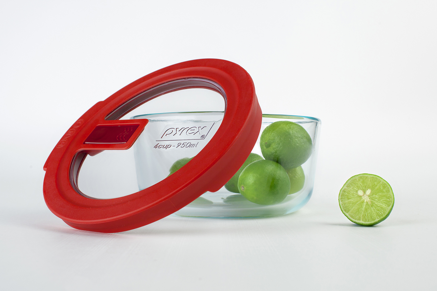
Pyrex had a problem with their existing line of storage products. Their high end product was leak proof but did not visually convey this strongly enough to gain consumer confidence. Their low end product was not leak proof but appeared to be. The result was that the high end product was losing sales to the low end and the low product was then failing the user's (incorrect) expectations.
The task was to create a mid tier product that was leak proof and communicated this strongly to the consumer. In the process, Pyrex wanted to unify their visual design language to make the high, mid and low end products read as a family, not individual product lines.
The outcome was the No Leak Clear lids. The outer rim was kept substantial to tell the no leak story in a convincing fashion while still managing to reduce the material usage and production costs. The new push to release steam valve added increased usability over the existing lift to open style. The result was a product that communicated a proper message to the consumer while unifying the VBL and increasing profit margins.
It is also a Good Design Award Winner & Spark Award Finalist.
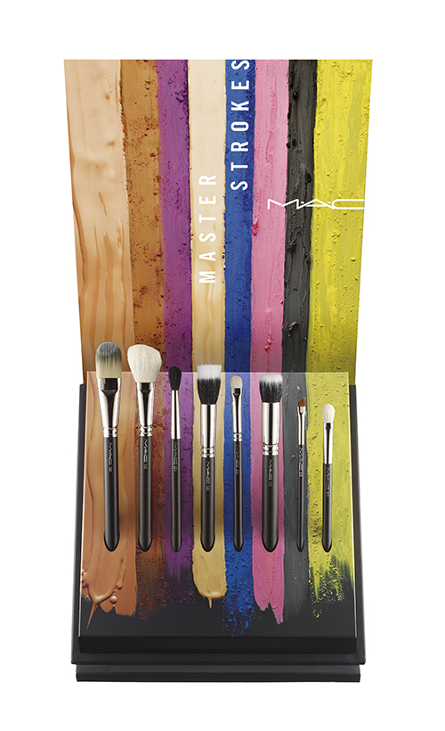
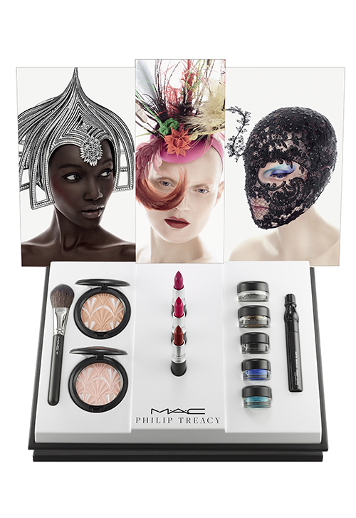
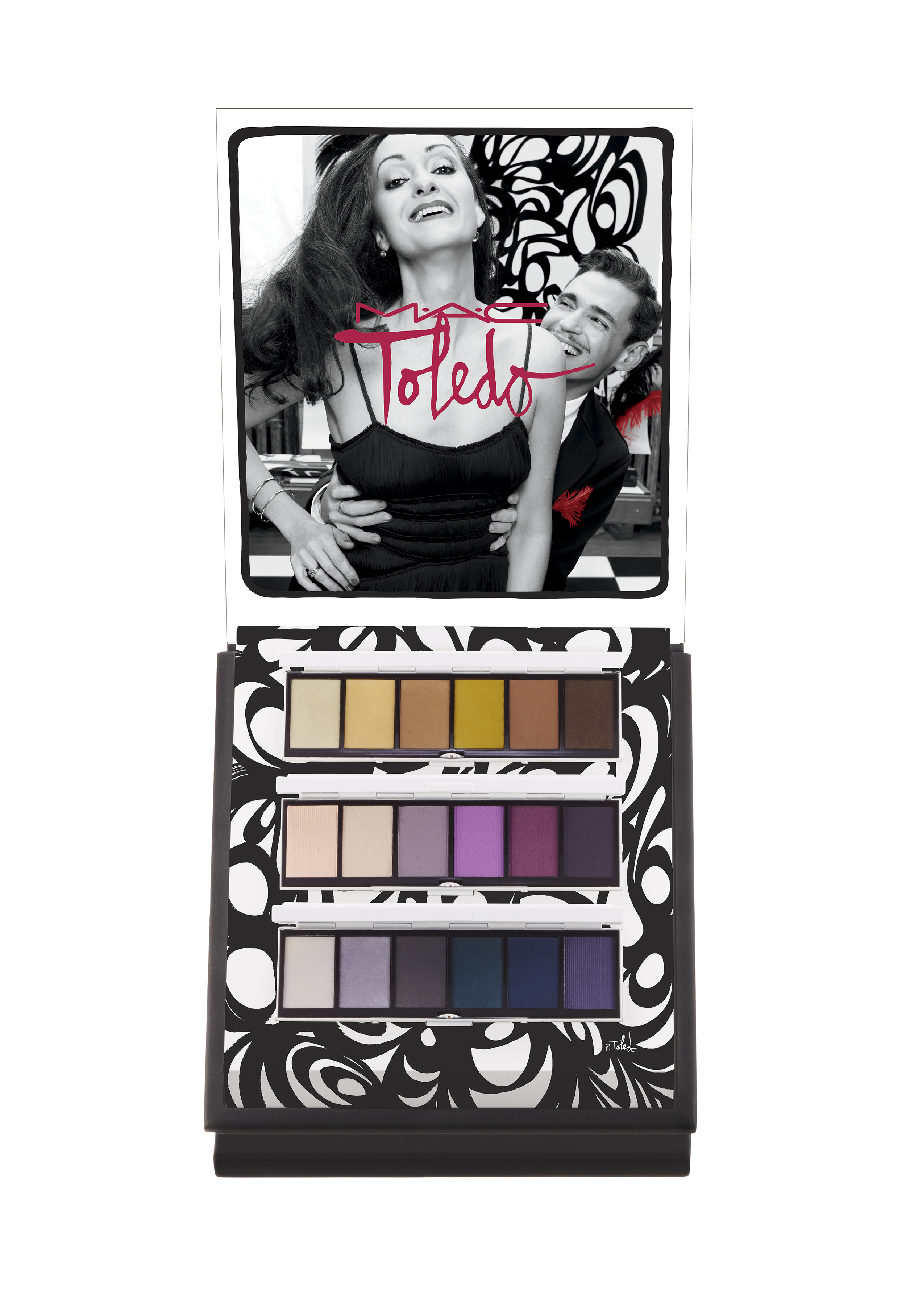
M•A•C Cosmetics Retail Merchandising Elements
M•A•C Cosmetics Retail Merchandising Elements
M•A•C Cosmetics: Store Merchandising & New Store Format
To adjust to shifting retail trends and changes in generational shopping tendencies, M•A•C began the process of shifting their retail experience towards open sell concepts, allowing the consumer to explore, learn, test and collect purchasable items with no assistance from in-store staff.
To assist this transition, I designed an open sell bin that made use of existing display elements, (The template that holds the testable product is used in an previous M•A•C display format.) as well as conformed to the constraints of existing store architecture.
The modular bin can accept templates to display the full range of M•A•C products and includes a set of risers to account for varying sizes in the merchandised packaging.

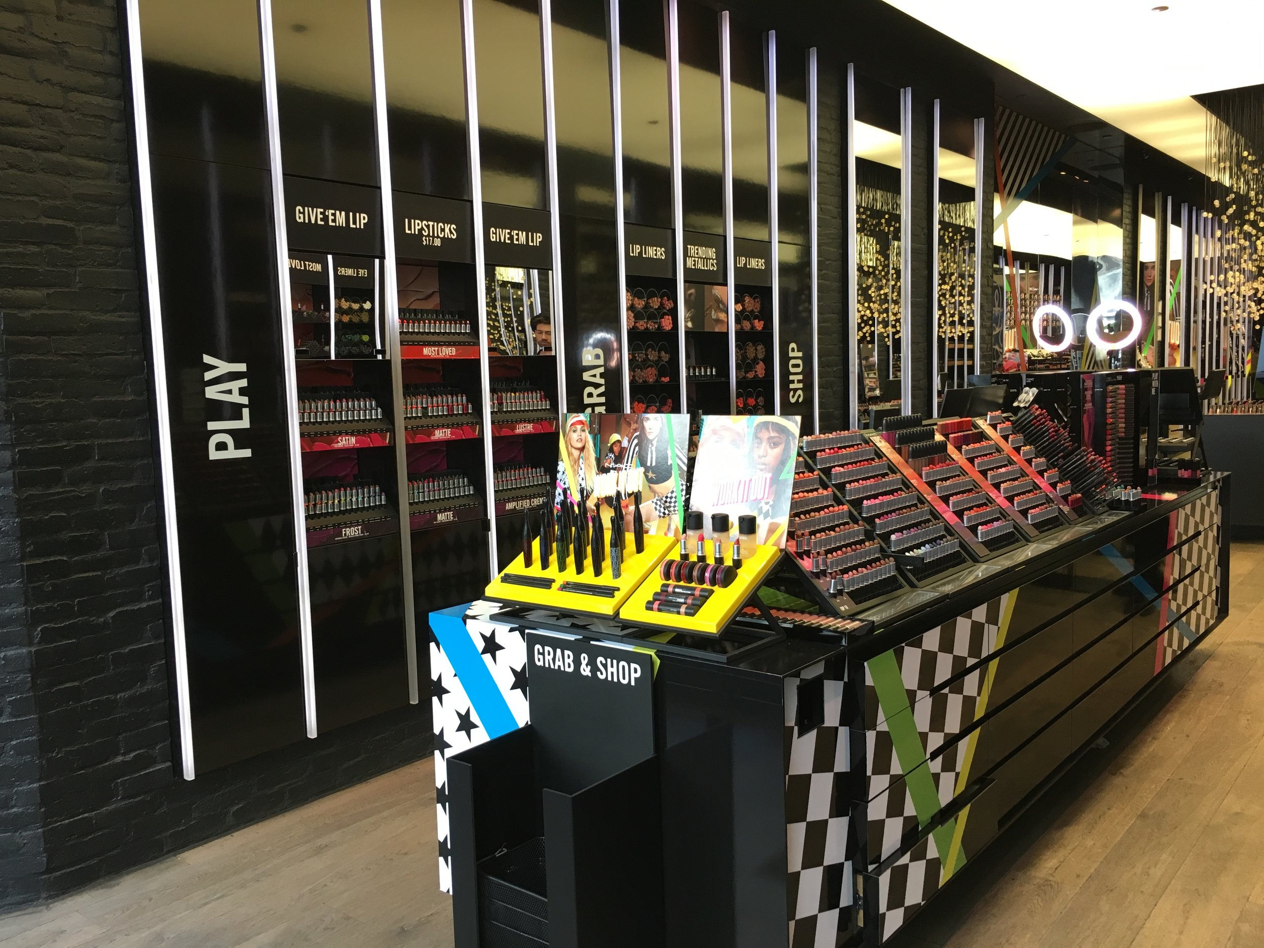

The next evolution in M•A•C's push towards an updated retail experience was the development of a new store format designed expressly for a consumer led physical retail journey.
I designed product display panels to fit within bounding frames that were a strong visual element of the architecture and design language created for the new store format by the M•A•C Store Design department.
To create a cohesive "self-serve" consumer experience across store formats, I made use of the open sell bins that I had developed for existing stores. Top display panels, featuring new launches and hero products, were also used, similar to what our customers encounter in M•A•C's specialty-multi locations. Mirrors and large headers assist in store navigation and consumer led product application. A wall mounted hygiene and applicator unit promotes increased & hygienic testing.
The use of previously tooled components reduced the cost of development and helped fulfill the design brief to reduce overall build out costs.


M•A•C Cosmetics Augmented Reality Mirror
M•A•C Cosmetics Augmented Reality Mirror

M•A•C Cosmetics Augmented Reality Mirror
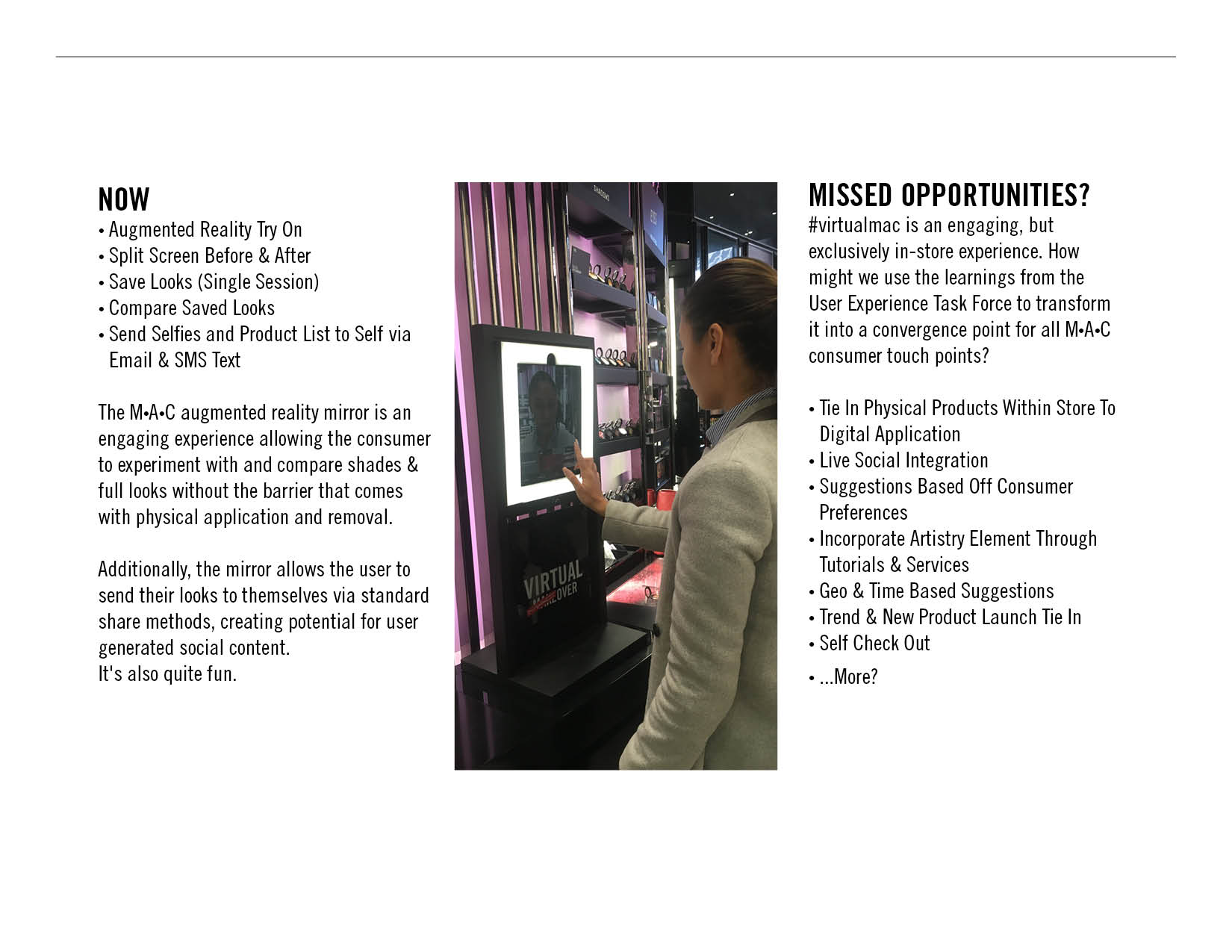
At the request of the M•A•C Omni-Channel team, I designed a stand to house the rollout of the #virtualmac augmented reality mirror. The stand contains an iPad Pro housing which tilts to account for differences in the heights of the user. The iPad is framed by a selfie light which can be dimmed or turned off to adjust to changing lighting conditions.
The M•A•C augmented reality mirror application is an engaging in-store experience allowing the consumer to experiment with and compare shades & full looks without the time/hygiene barrier that comes with physical application and removal.
Additionally, the mirror allows the user to send their looks to themselves via standard share methods, creating potential for user generated social content.
Wireframes & graphics for the #virtualmac application were designed by the M•A•C cosmetics Omni-Channel & New Media teams.
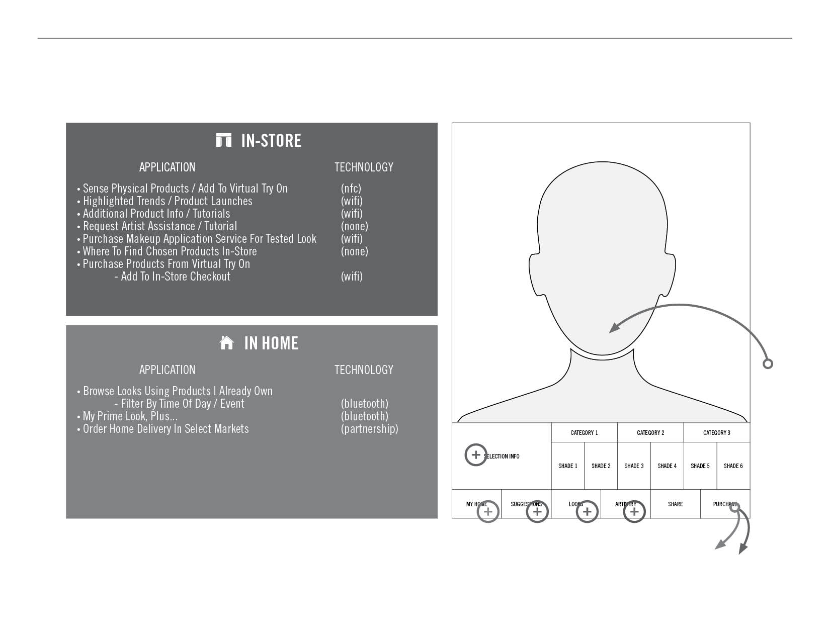
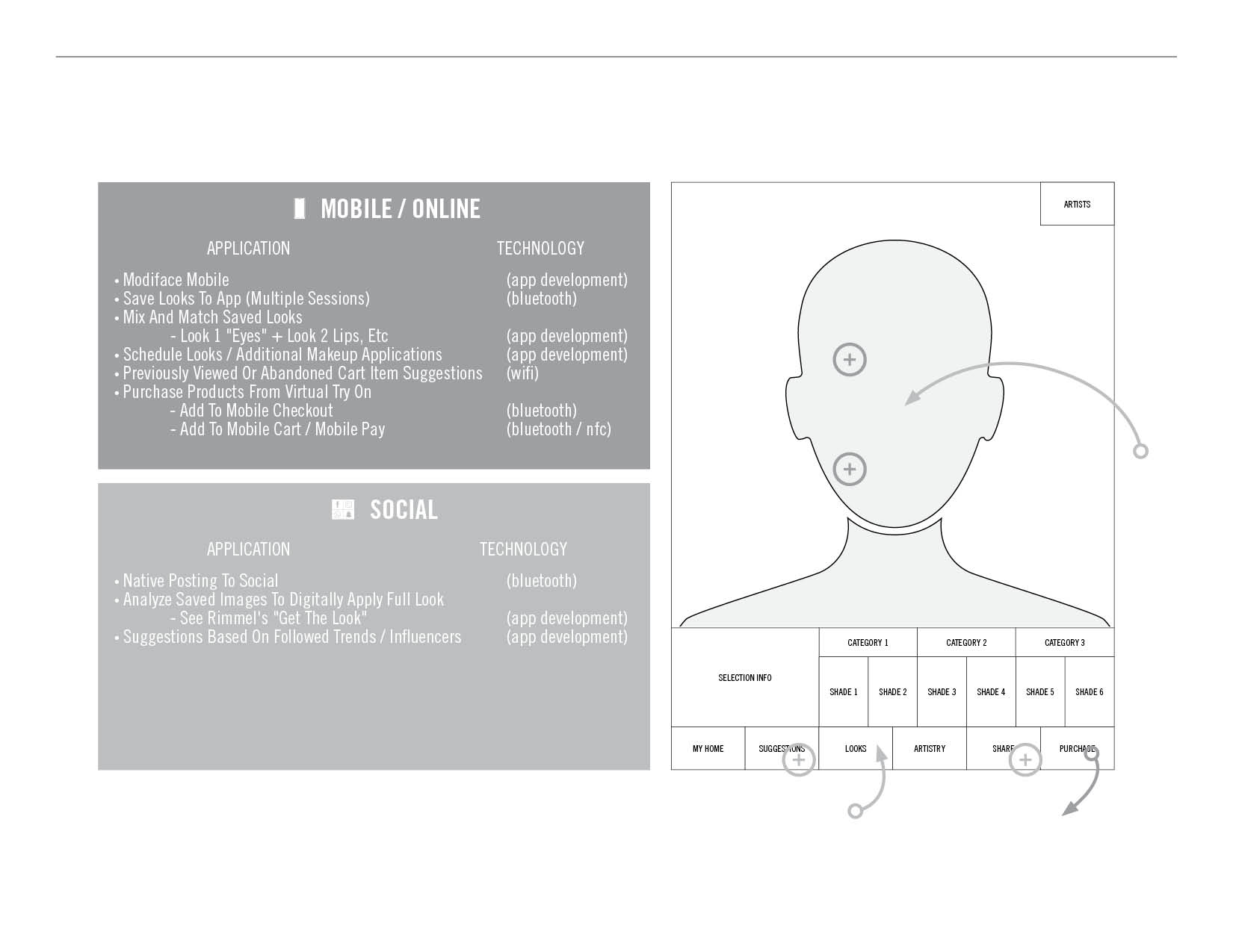
Now
The #virtualmac app in it's current state contains the following functionality:
• Augmented Reality Try On
• Split Screen Before & After
• Save Looks (Single Session)
• Compare Saved Looks
• Send Selfies and Product List to Self via Email & SMS Text
what could come next is where it gets exciting...
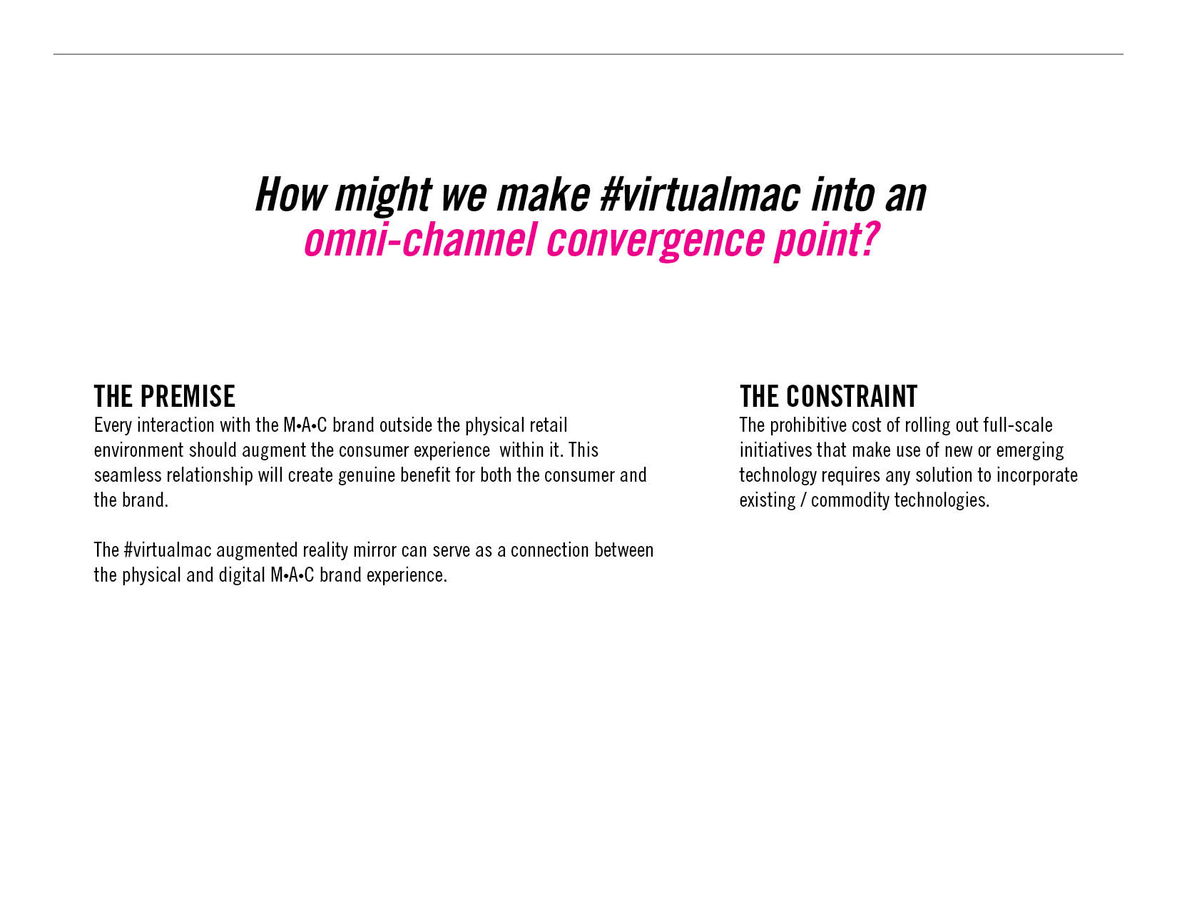
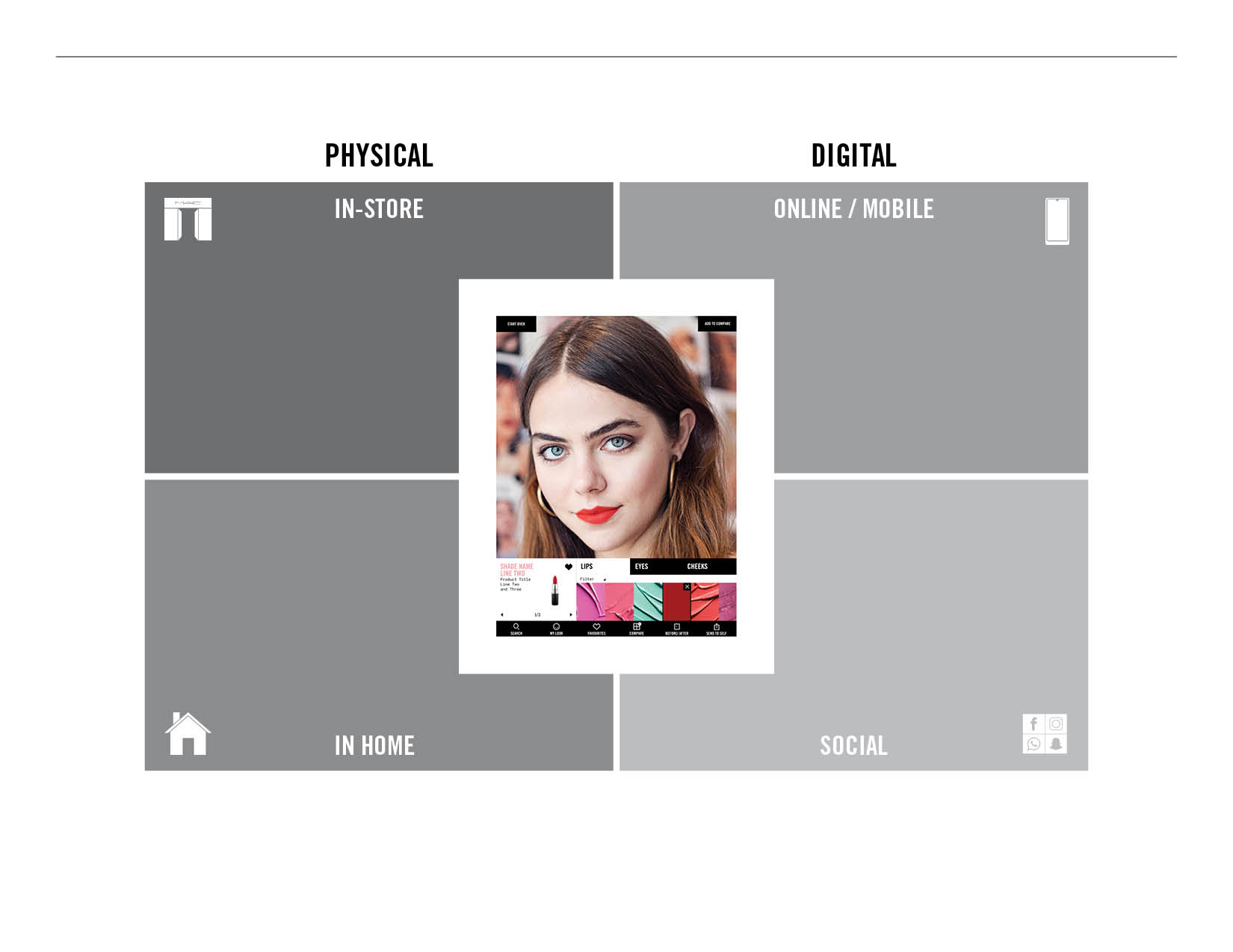
#virtualmac is an engaging, but exclusively in-store experience. How could the learnings from the User Experience Task Force transform this into an experience that ties together all the M•A•C consumer touch points?
How might we make #virtualmac into an omni-channel convergence point?
Makeup Packaging
Makeup Packaging
M•A•C Cosmetics Makeup Primary Packaging
"Dangerous" "Ill Repute" "Fetish". These were the adjectives given to me as inspiration for a mascara packaging brief. In the component I developed I attempted to play off these ideas as well as add in an element of surprise while also considering the consumer experience of physically using the product.
The final product is a visual paradox: warning the user not to touch, while remaining just inviting enough to tempt. Upon holding the product, the user finds the spiky exterior to be composed of soft material that gives to the touch and rebounds back into form, supplying both a contradiction as well as a comfortable hold while applying the mascara.
Final product form images to be added upon launch.

Printed Form Models
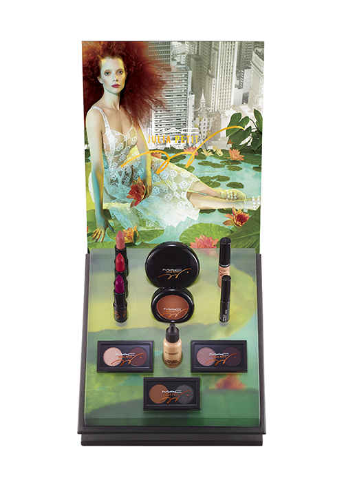
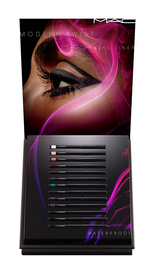
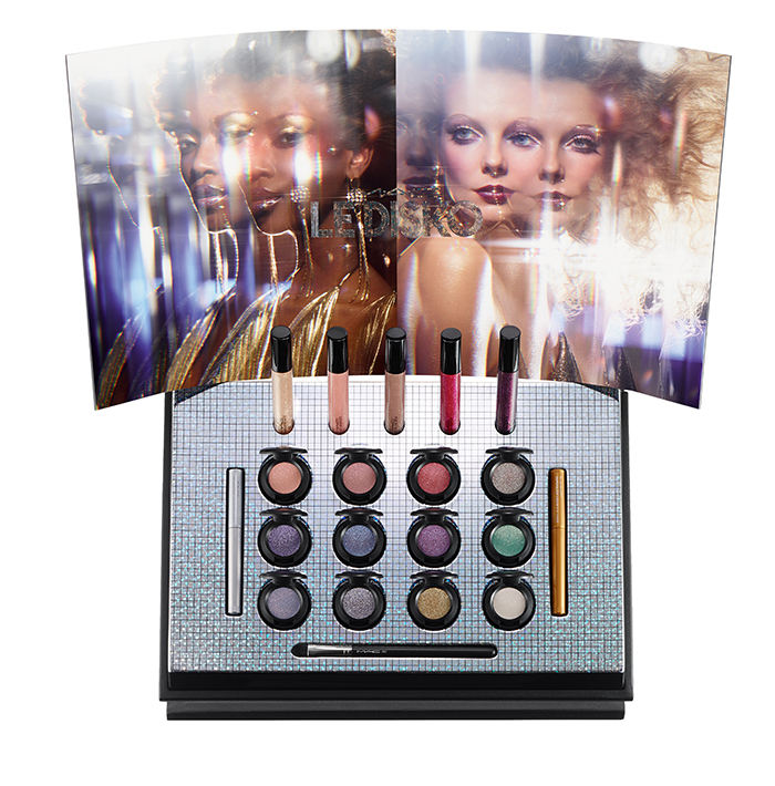
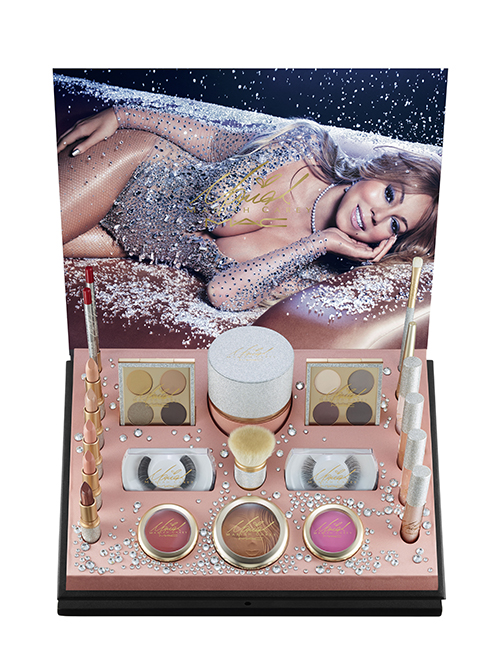
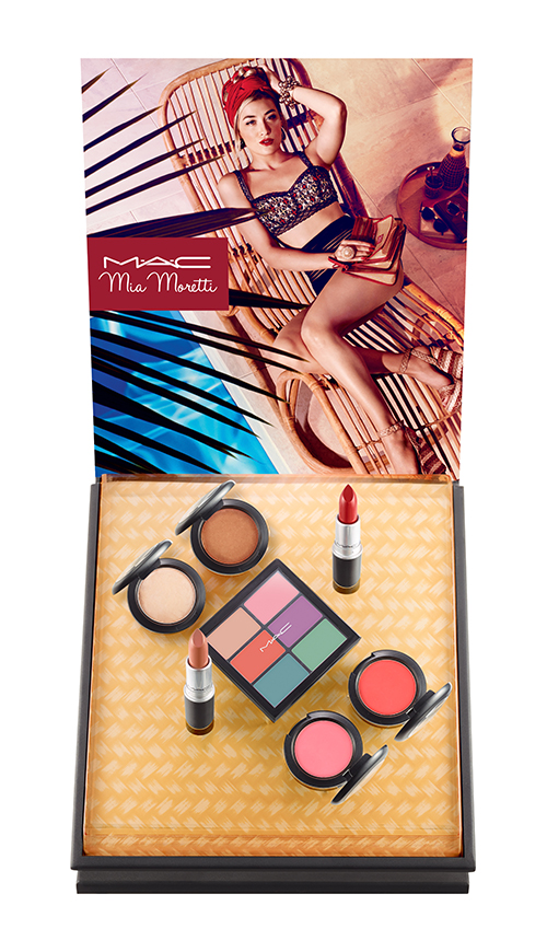
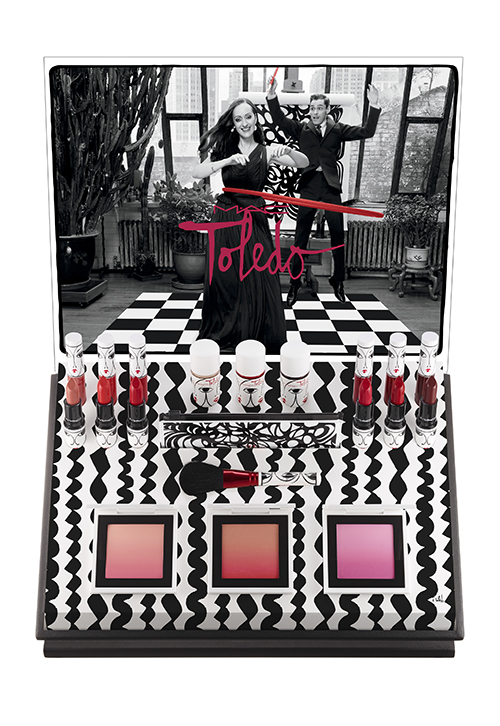
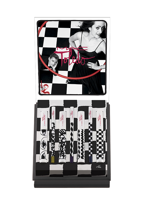
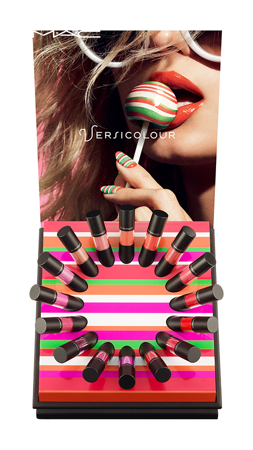
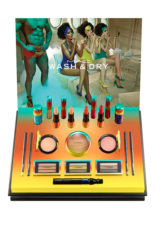
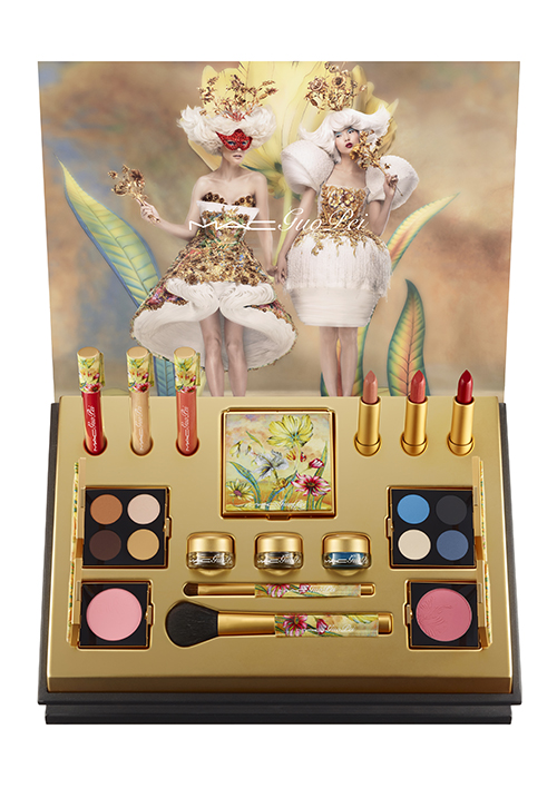
M•A•C Cosmetics Seasonal Launches
M•A•C Cosmetics Seasonal Launches
M•a•c cosmetics collections & collaborations
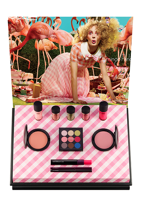
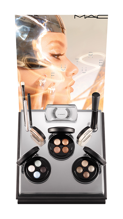
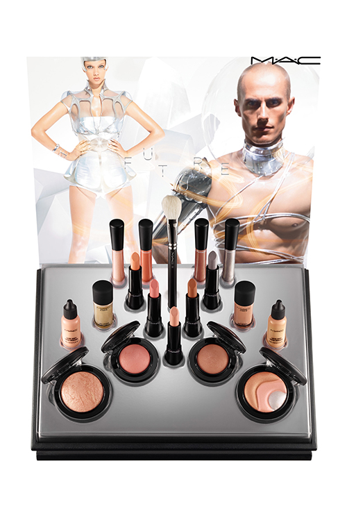
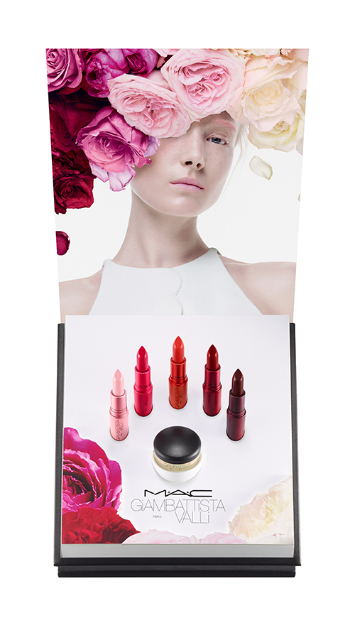
At M•A•C Cosmetics, I lead the industrial design team in the design and development of seasonal collection & collaboration launch displays. Through product layout & unique finishes, our aim was to highlight & compliment the beauty visual and/or spirit of the featured collection. Finishes included, litho printing, appliques, metallization, surface mounted crystals, custom color matching, fur & sand application, mirror & gel light manipulation, screen printing, foil stamping and various combinations of several of these techniques.
I also worked to refine & streamline the development of seasonal timelines & processes, working directly with internal marketing, packing and visual creative as well as manufacturing vendors to eliminate errors and improve final display quality.

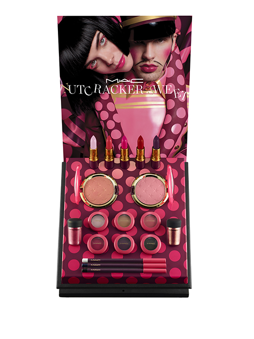

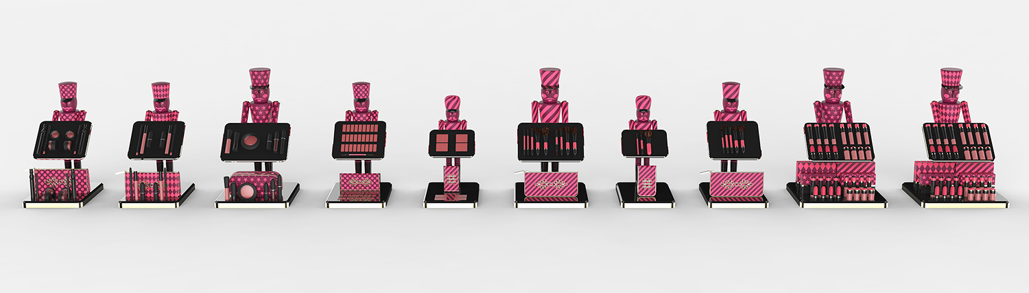
M•A•C Cosmetics Nutcracker Sweet
M•A•C Cosmetics Nutcracker Sweet
M•A•C Cosmetics 2016 Holiday kits
Taking inspiration from the classic holiday figure, I designed the 2016 holiday kit display for M•A•C Cosmetics: Holiday Sweet.
The classic form of the nutcracker was wrapped in the colours & patterns of the holiday packaging and aligned to create a playful army, presenting the consumer with the special edition holiday kits.
In addition to the design development of the display, I travelled to China to oversee and approve final samples; visiting woodworkers, pad-printers, nutcracker manufacturers, injection molders & assembly partners.
To complement the holiday kits, I designed the accompanying holiday colour launch display.
The resulting collection was described by M•A•C artists as "The best Holiday we've ever done.", resulting in over $60M in international sales.


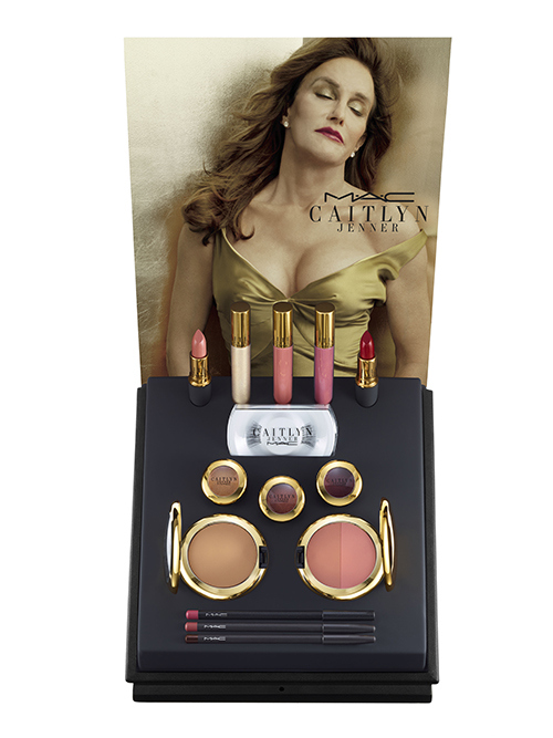
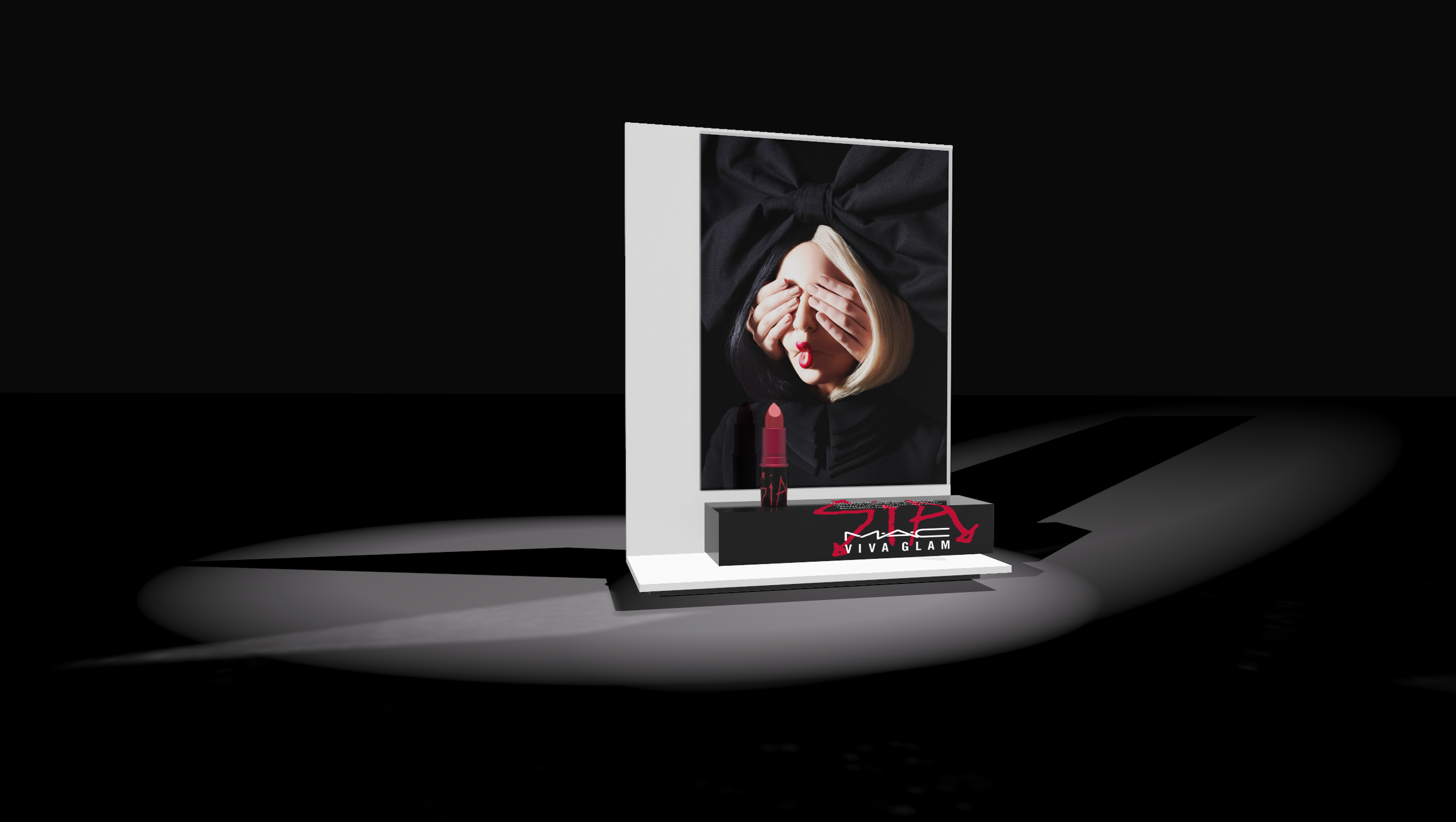
Viva Glam Sia
Viva Glam Sia
MA•C Cosmetics Viva Glam Sia
Since its inception in 1994, Viva Glam has been the face of the M•A•C Aids Fund. Each year a celebrity spokesperson becomes the face of Viva Glam, working with M•A•C to create their own customized lipstick shade. Every cent of the sale price of the Viva Glam lipstick goes towards helping women, men and children living with and affected by HIV/AIDS. Over the years Viva Glam has contributed over $400 million towards the M•A•C Aids Fund.
Sia was 2018's Viva Glam spokesperson. For her display I took inspiration from the stark architecture of her This is Acting tour, and chose to play off her iconically veiled presentation of herself.
I envisioned a display that countered the visual of Sia's covered face by making that image the single dominating feature. The form of the display itself is composed of primitive geometry, a rectangular solid pedestal and a flat backdrop & base. The image of Sia is large in relation to the rest of the display, and presented behind "glass"; a reference to museum aesthetics saying that while her face may be covered, you are meant to stand and stare.
Logo lockup and placement on display is the work of the M•A•C Print & Special Event team.
M•A•C Cosmetics Fix+ Hacks Video Display
M•A•C Cosmetics Fix+ Hacks Video Display
M•A•C Cosmetics Fix+ Hacks VIDEO DISPLAY & New Scent Rollout
In Spring of 2018, M•A•C released 3 new scents of its iconic Prep+Prime Fix+ spray. To highlight these new scents and promote greater awareness of the versatility of Fix+, M•A•C planned special events as well as in-store displays.
I was delivered a design brief for two displays intended to Inspire and Educate new and existing Fix+ customers.
Inspire
The first display, placed at in-store makeup stations, featured the 3 new Fix+ scents and an auto playback display featuring "mist opportunity" influencer videos.

Educate
The second display, designed for both in-store and special event applications, highlighted Fix+ versatility with video tutorials of back-stage makeup artist' hacks. The 4 variations of the display include testable Fix+, selected hackable product (or a pre-mixed tester), application tools and hygiene wipes.

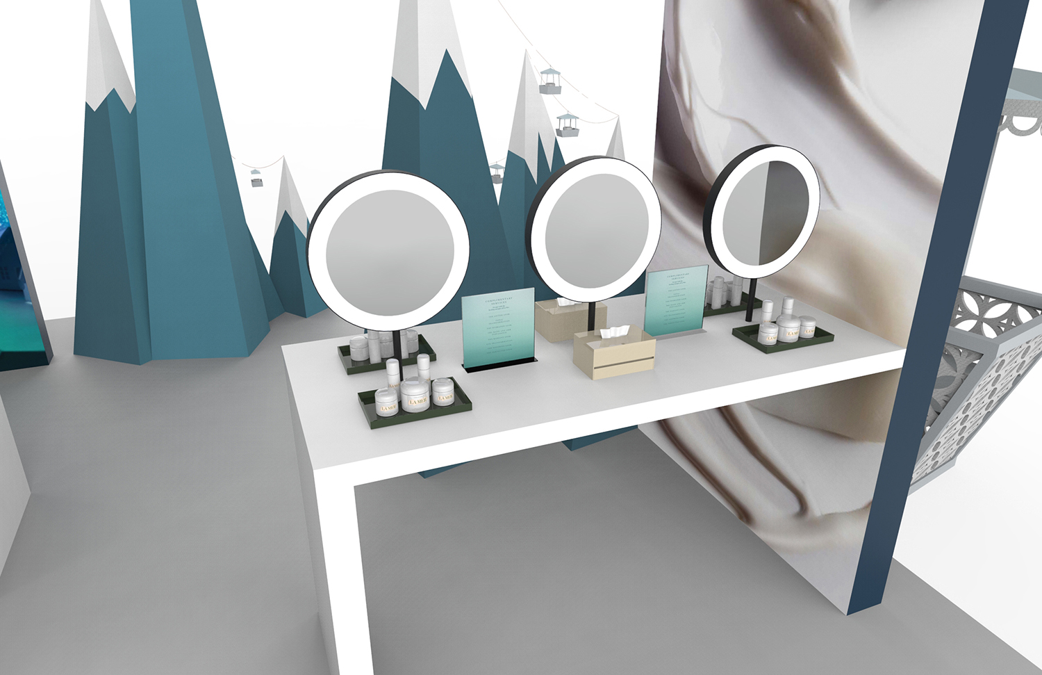
M•A•C Cosmetics Spring 2018 Collection Showroom
M•A•C Cosmetics Spring 2018 Collection Showroom
M•A•C Cosmetics spring 2018 Collection showroom
When designing a table to display the Spring 2018 seasonal collections, my focus was for the table itself to fall away, allowing the campaign films, product collections and overall moodiness of the room designed by Luce de Palchi to remain the focus.
Working together with Matt Pearson, we designed a fully clear acrylic table with with trapped graphic visuals as the only opaque features. The effect is products that appear to almost float, and dramatic shadows being cast on the floor that themselves become strong visual elements in the room.


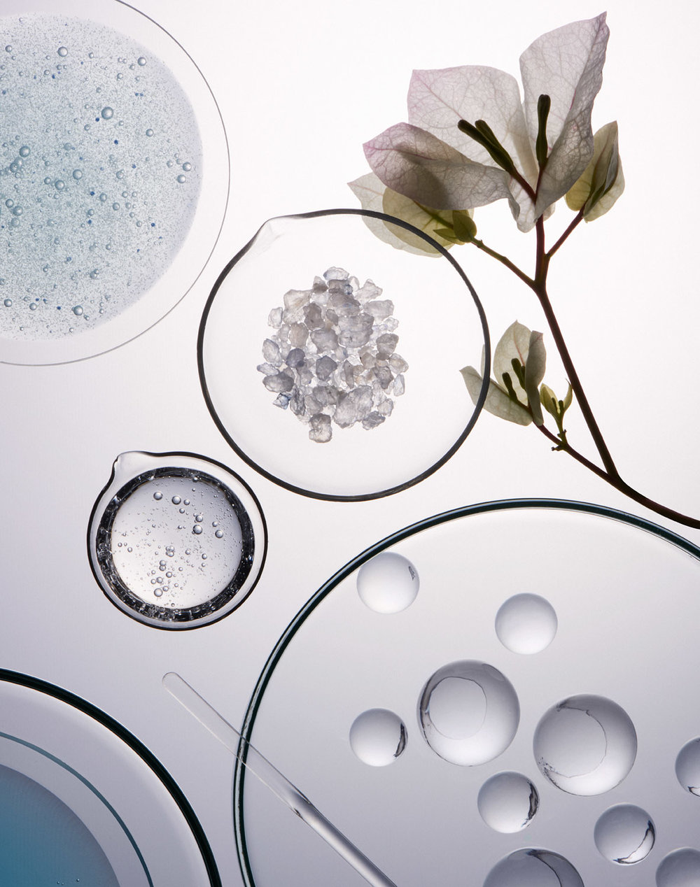
La Mer Renewal Oil Highlighter
La Mer Renewal Oil Highlighter
La mer renewal oil highlighter
To re-promote a hero product, The Renewal Oil, La Mer requested I design an on-counter highlighter unit to feature the product. The Renewal Oil is a 2-stage product that activates by separating into bubbles when shaken prior to application. I chose to focus on these bubbles and the golden hue of the product when designing the highlighter.
The product itself sits on a golden riser and is surrounded by acrylic bubble forms that are cast with convex lenses that magnify the bottle. Behind the product is a singular large lens that creates a vignette around the product as well as magnifying the beauty visual. Each bubble and lens has a foil stamped golden rim to call out the luxurious qualities of the product.


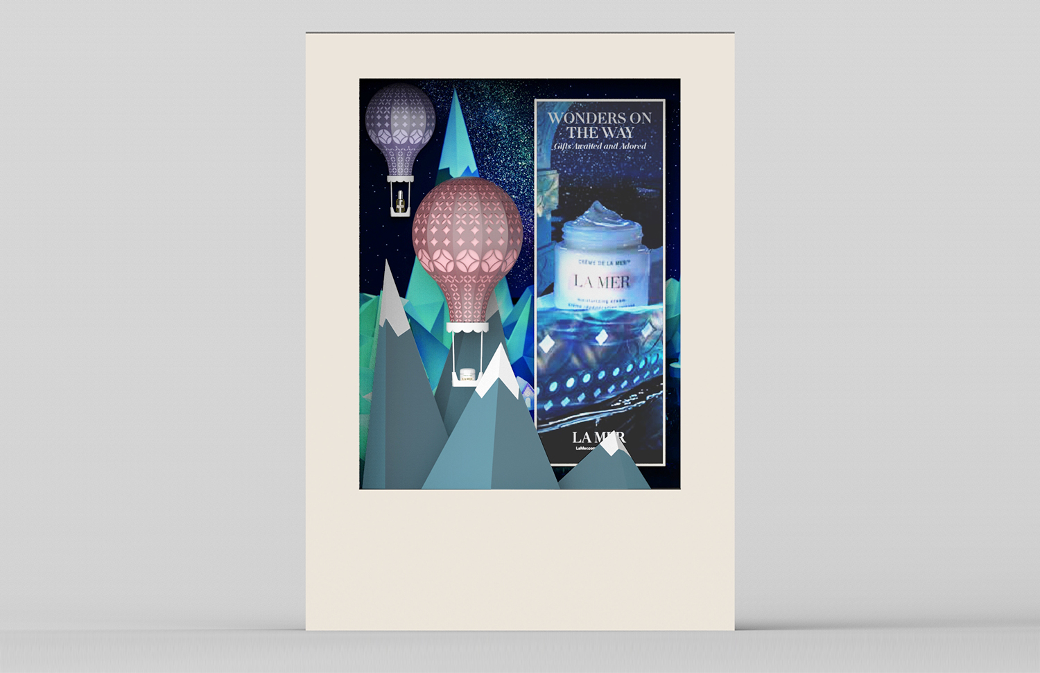
La Mer 2018 Holiday Event
La Mer 2018 Holiday Event
La Mer 2018 Holiday: Fantastical Cities
La Mer collaborated with artist Zoe Bradley to create dream-like paper and light landscapes used to create their beauty and social visuals. These images were provided as inspiration for their on-counter activations and consumer events.
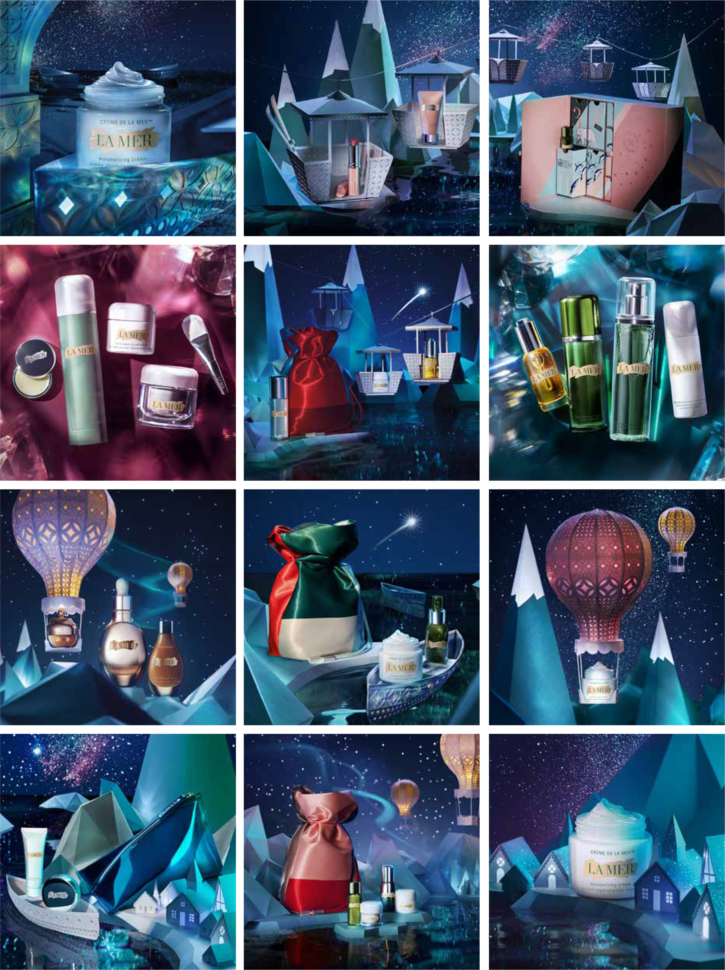
I referenced the paper landscapes to design the 2018 Hong Kong Holiday Road Show and large consumer event guideline.
Design distorted the miniature scenes from holiday social content into exaggerated scenes of mountain scapes with product carrying gondolas, floating hot air balloons and a large gondola for users to sit and photograph themselves and their surroundings.
Event included stations for Complimentary Services, Product Testing, Holiday Kit Display, Consumer Bounce-back, Gifting and UCG Stations.
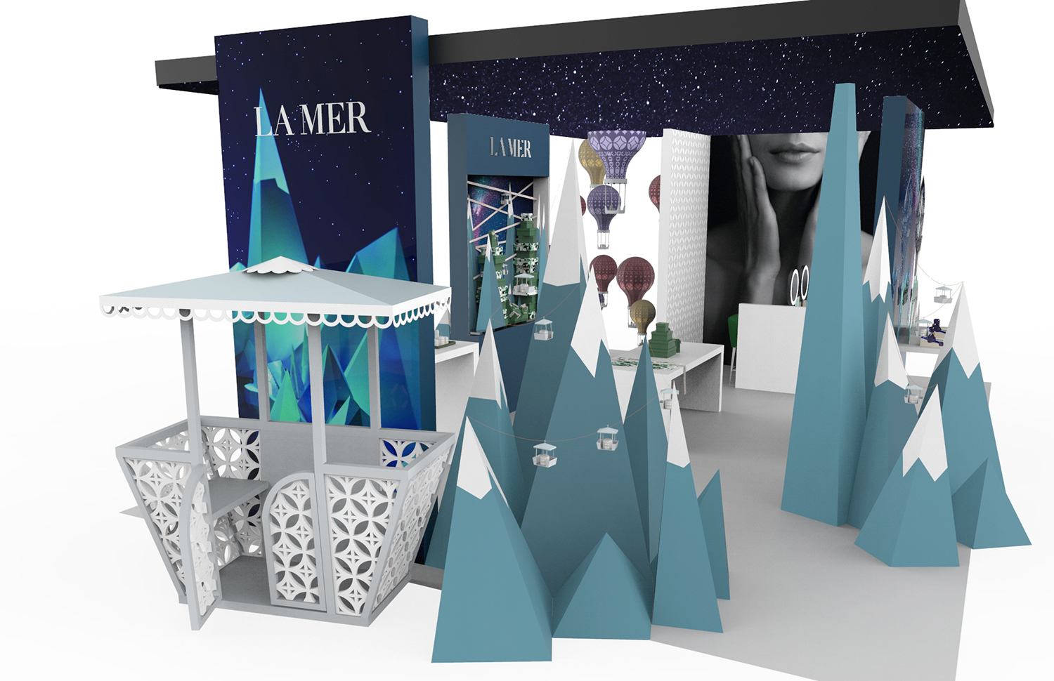
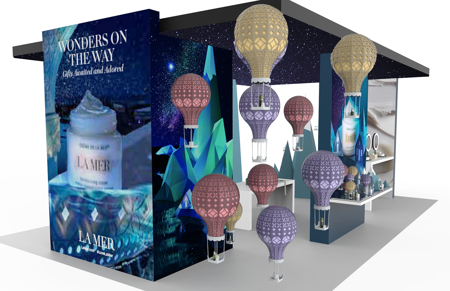
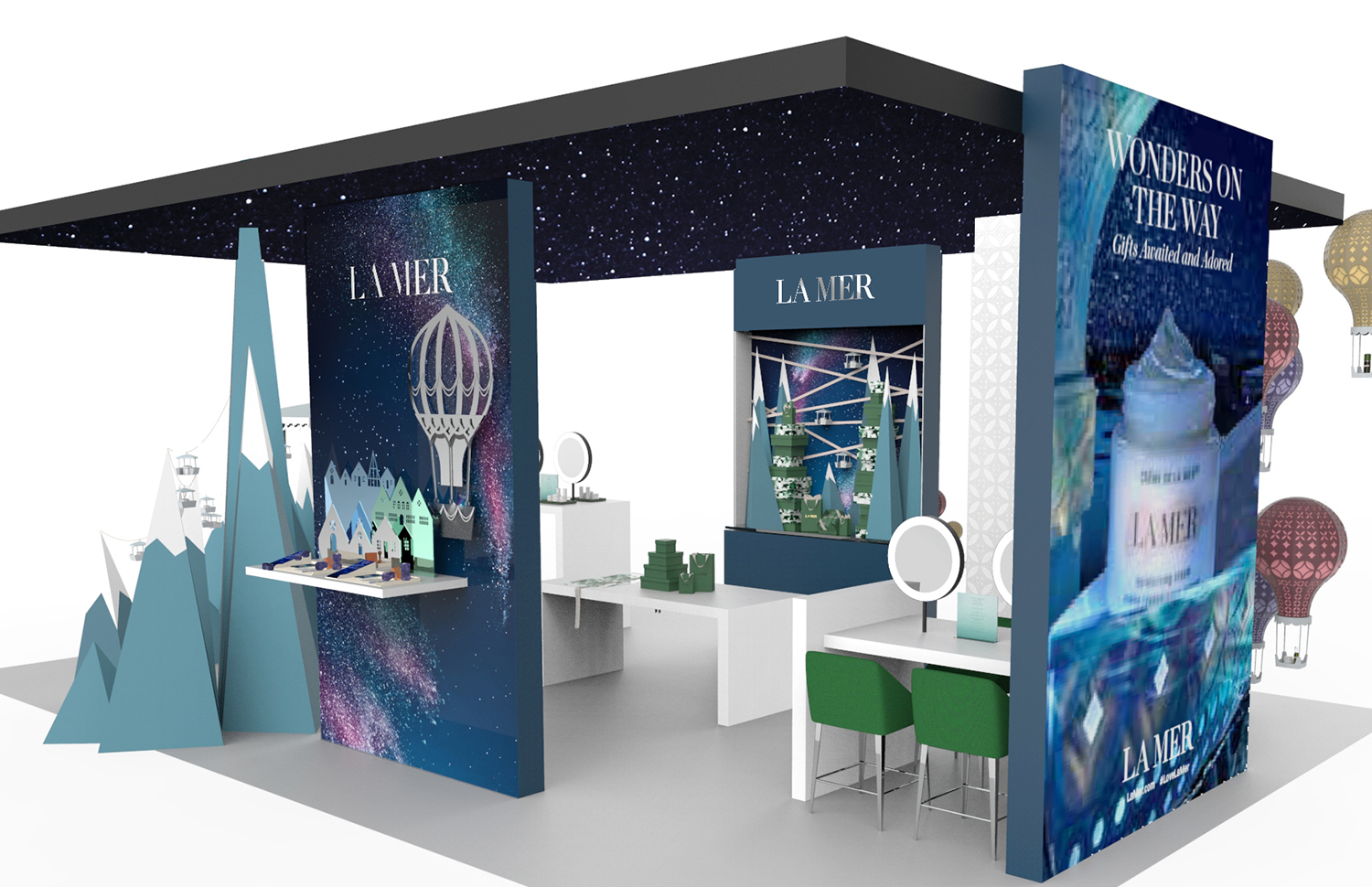
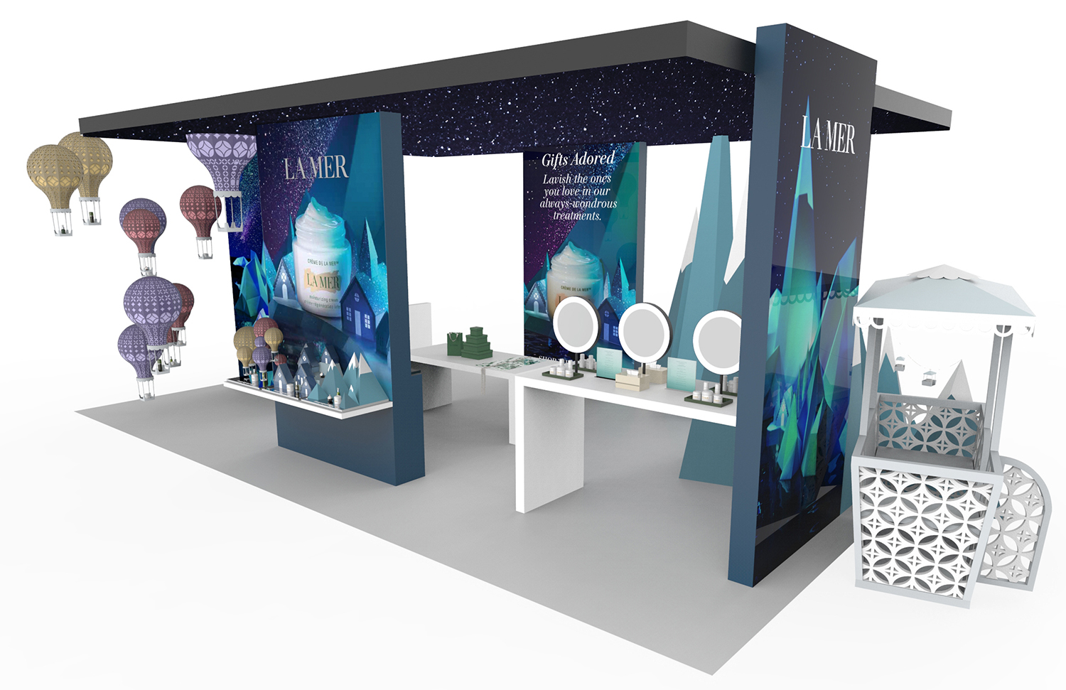
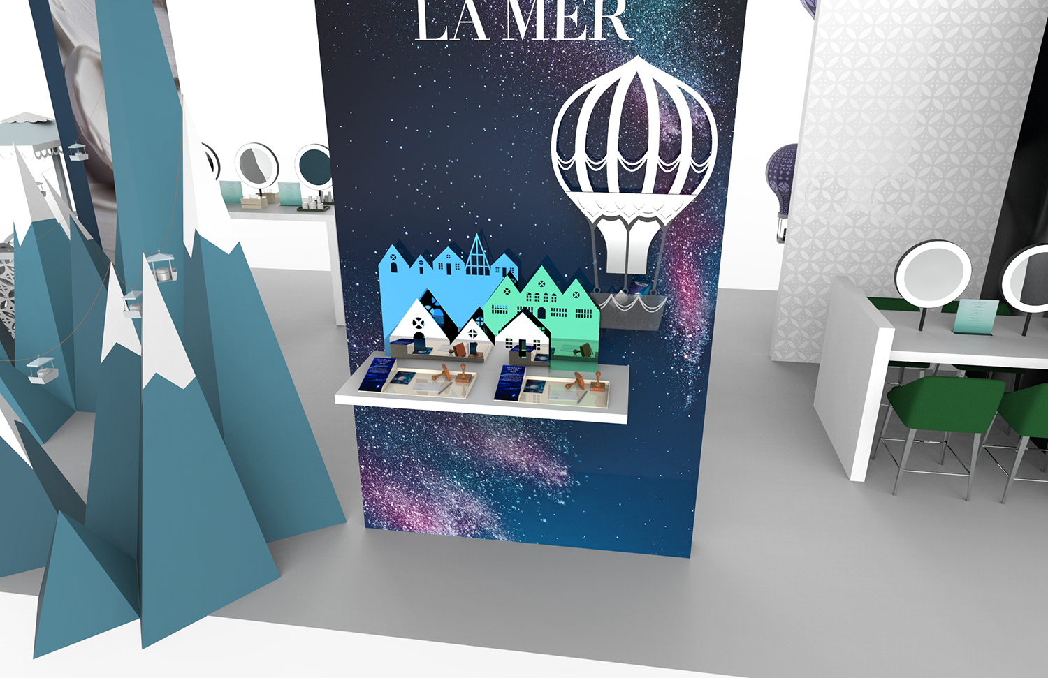
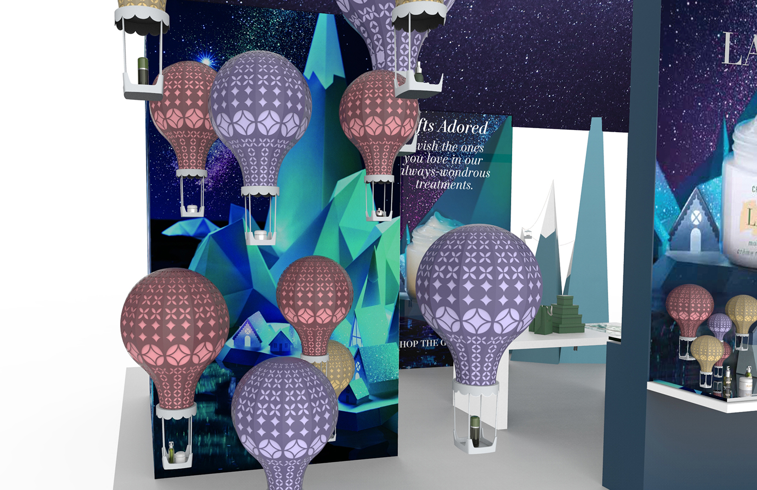

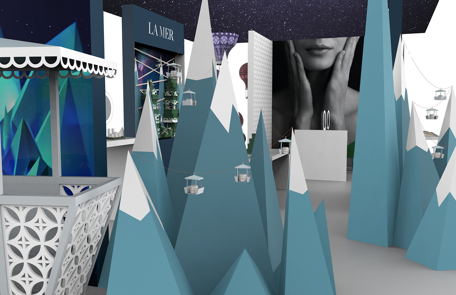
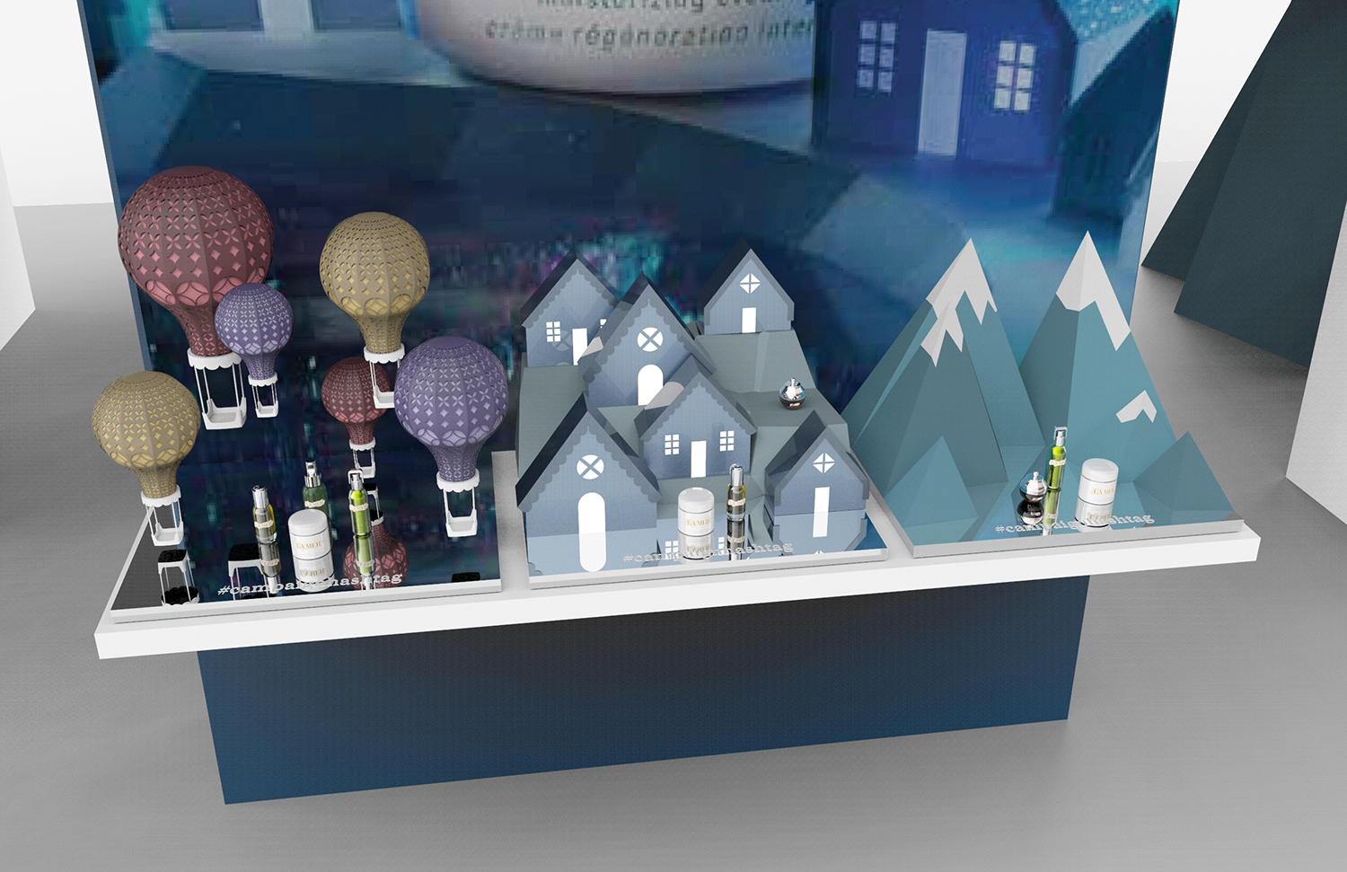

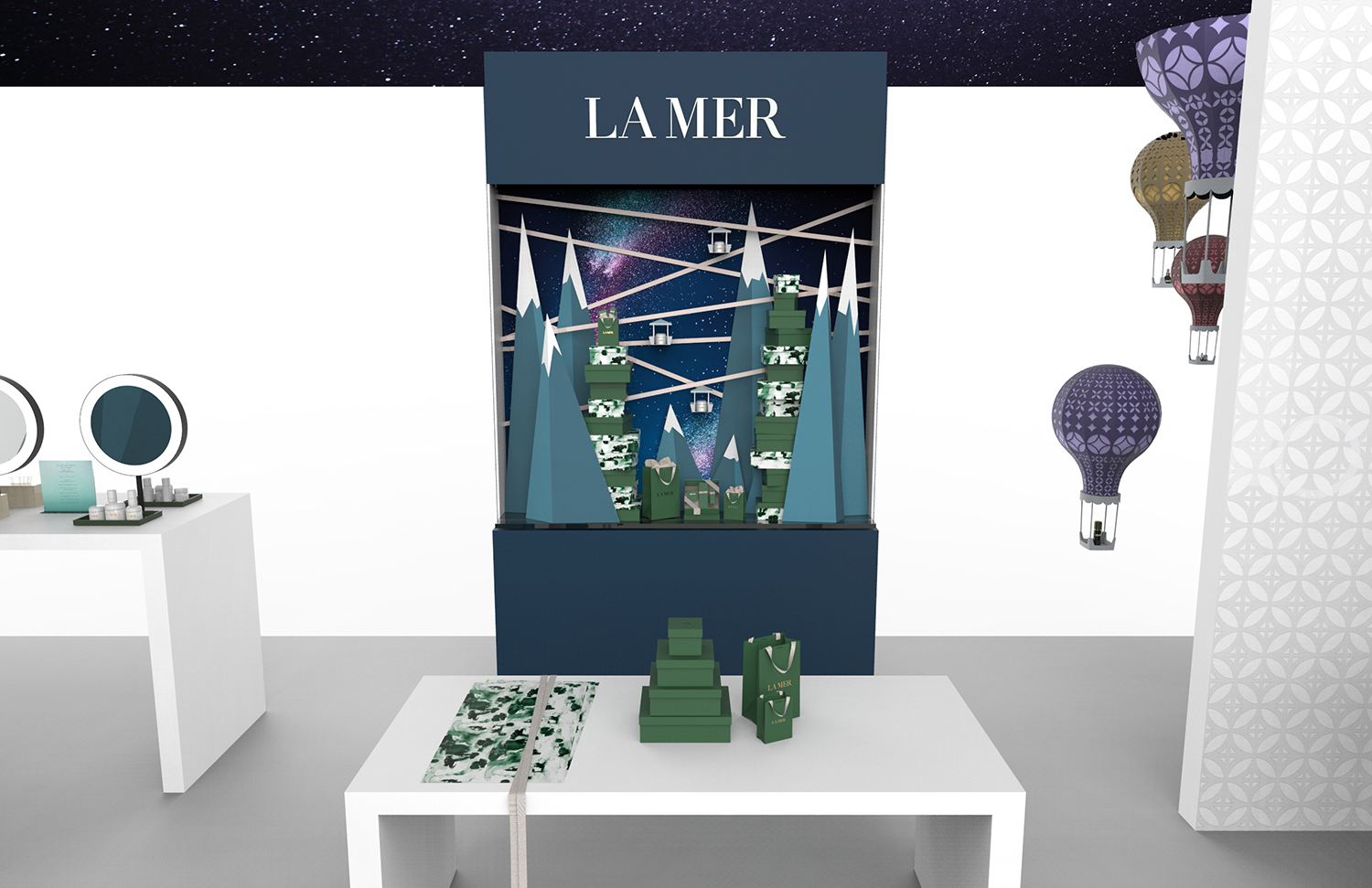
I also translated the larger consumer event design into small and large window display guidelines, making use of similar mountain and hot air balloon elements.

Fluency
Fluency
Fluency is a response to families keeping their fine dinnerware in the drawer to be brought out only a few times a year. The set is long and elegant, yet strong and durable; dedicated to creating an eating experience, every day.
Fluency is designed to be held at the far end of the handle, where the stem flares. The added weight of this flare keeps each utensil perfectly weighted, balancing in the user's hand even without being gripped. This balance adds an increased feeling of control, which was incorporated to counteract the greater than typical distance from the hands to the plate. This distance was not an accident. By pulling the hands further away from the plate a clearer view and a more elegant yet delicate eating style is created. The goal was to encourage the user to put a little bit of thought into eating and combat simply going through the motions.
The aesthetic of the set is very long and lean, smooth lines bow out and back in upon themselves, creating just enough tension to be visually interesting but not troubling. The fluid lines are contrasted with slightly hard design lines down the side of each utensil that lead and focus the user's eye to the plate.


Verve
Verve
Client: Gensler for Haworth
Verve is a multi-functional task table with incorporated cable management and a little bit of whimsy.
Stretched across a framework on the underside of the table is sculptural netting which keeps cables from hanging into leg space. Excess cable can be wrapped around formed hooks on the wire table legs. The netting is attached to the table top via clips which appear to exert enough force to slightly pull the surface of the table inward. These recesses in the tables edge accomplish two things: they indicate sitting locations and facilitate aligned nesting of multiple tables.
The end result is a table that brings an element of experience, by slightly embracing the user & helping to manage cables in an easy to use manner that is not trying to convince you they are not there.


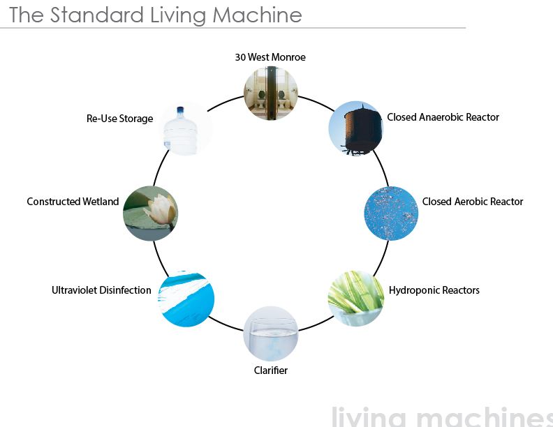
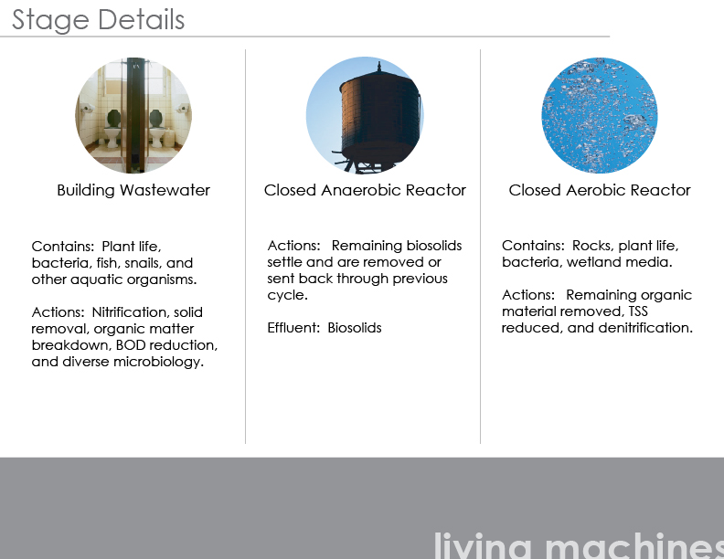
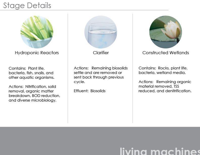
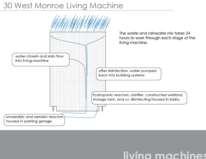
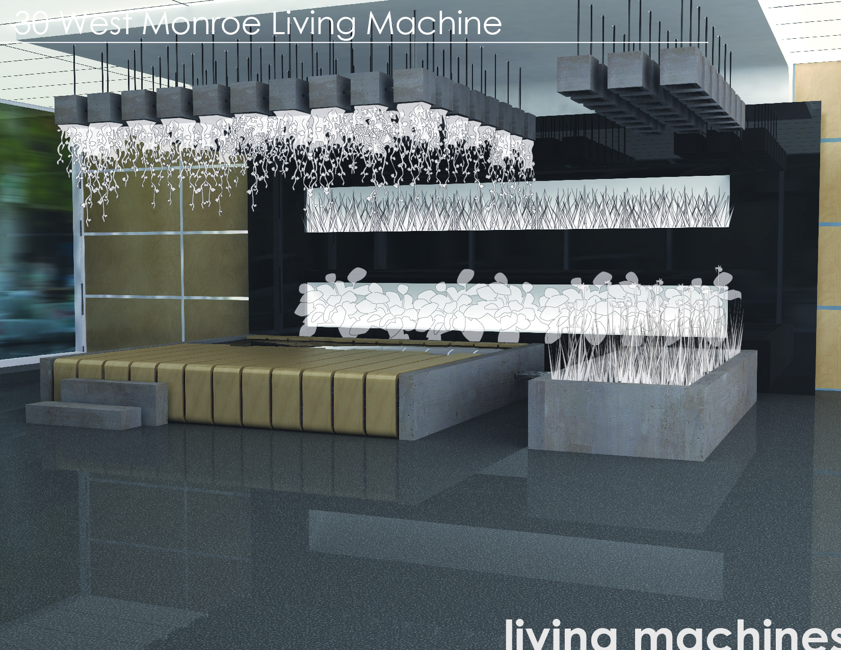
30 West Monroe
30 West Monroe
Client: Gensler
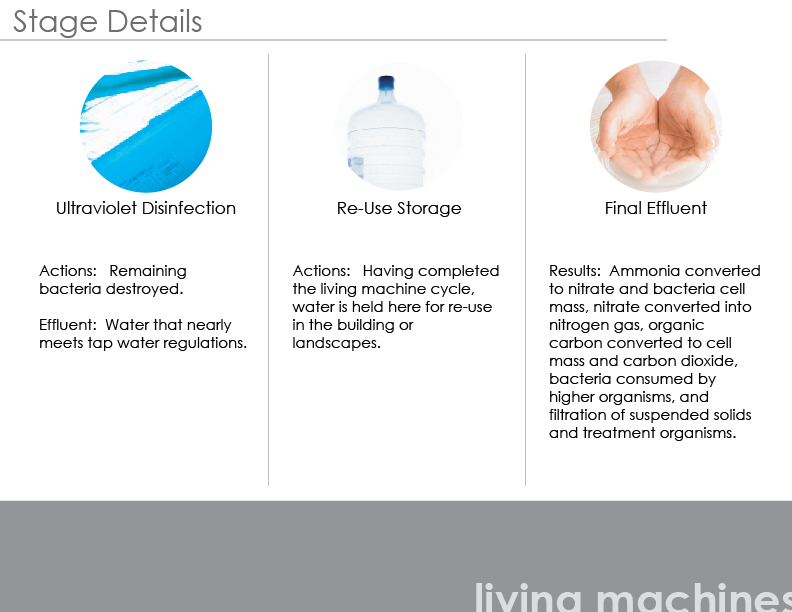
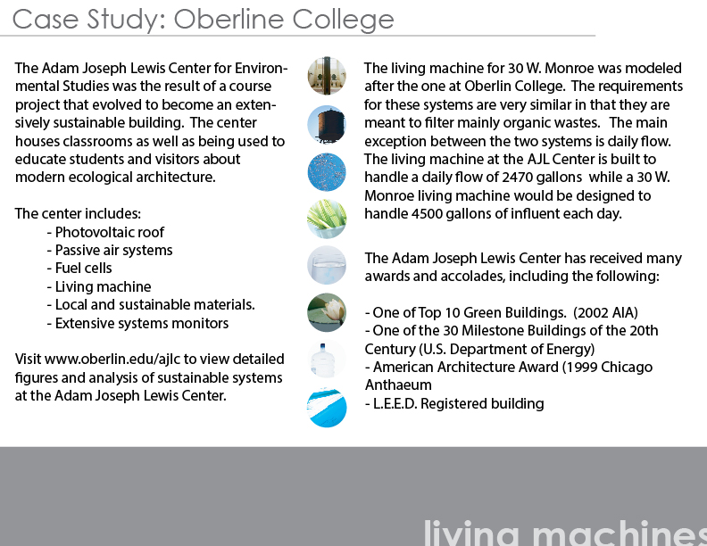
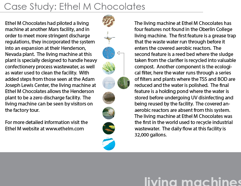
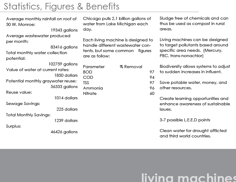
Gensler employees are encouraged to spend a portion of their time on green research. Their findings are then presented to the staff so that they can use new concepts in future designs. I chose to research and present living machines. Living machines are biological tools that naturally convert grey and black water into nearly potable water. As a means to convey the aesthetic possibilities in a setting the staff was very familiar with, I designed a living machine for the lobby of the building that housed the Gensler offices.